UK Athletics Unveils Updated Graphic Identity
Share
LEXINGTON, Ky. – UK Athletics unveiled an updated graphic identity in conjunction with its longtime partner, Nike at an event on Friday, with new football uniforms for the 2016 season and a one-time men’s basketball uniform making their debut.
The new system is the result of more than 18 months of collaboration between UK Athletics and Nike. Together, Kentucky and Nike worked with student-athletes, coaches, administrators, historians and alumni to evaluate the UK brand and envision its future. The character, integrity and championship-minded nature of UK Athletics – traits that stood out in the discovery process – are reflected in the new brand and identity system. As part of the updated graphic identity, all 22 Kentucky varsity sports will showcase consistent colors, logos, lettering and numerals.
“Kentucky is an athletics department with a rich tradition and an even brighter future,” Athletics Director Mitch Barnhart said. “Our graphic identity honors that long-standing tradition while looking toward that bright future. I am excited about the consistency this will bring to the department and thankful to Nike and the many representatives of UK Athletics who participated in this process.”
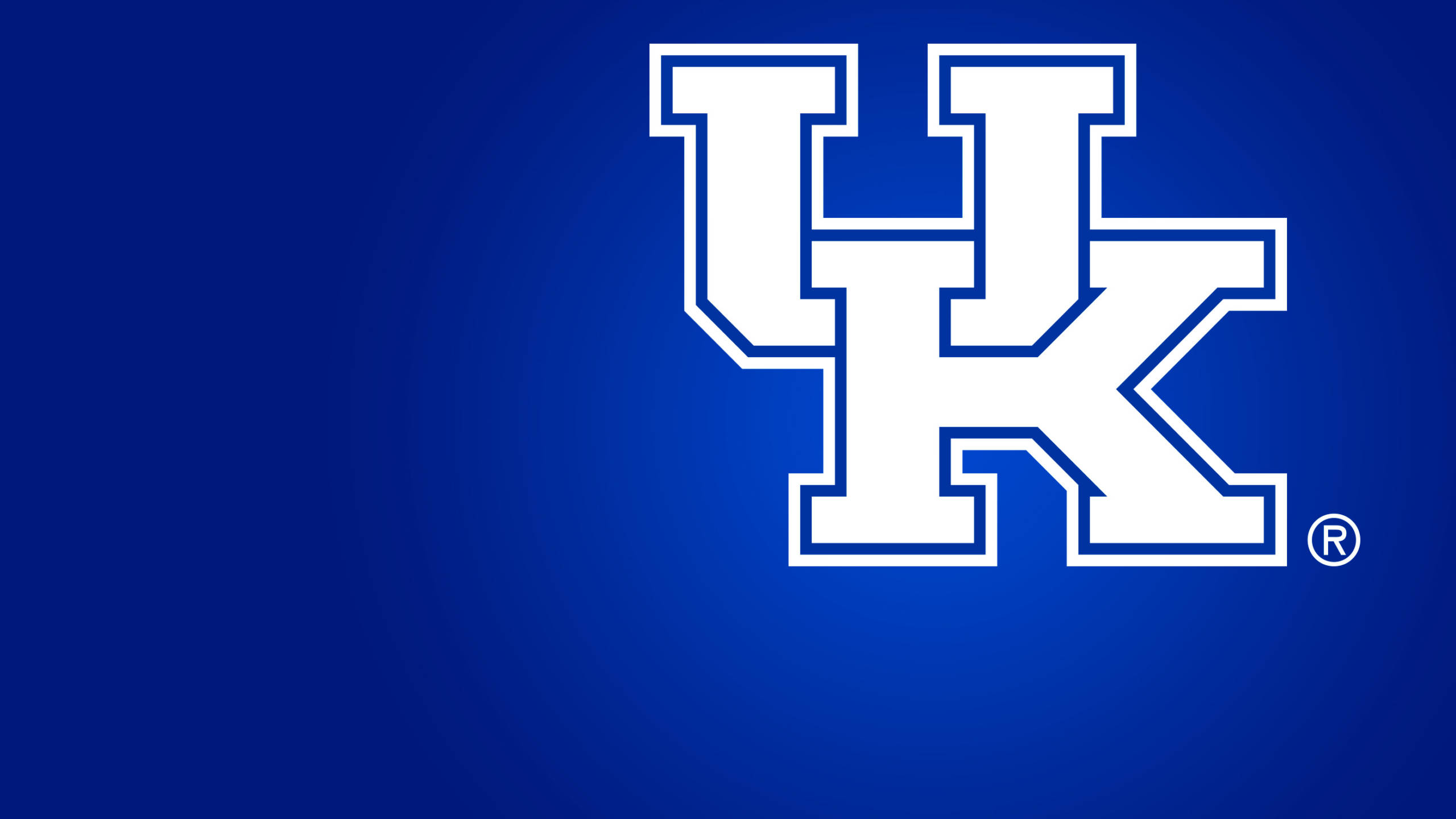
The centerpiece of UK Athletics’ graphic identity remains the interlocking UK logo. The most recent iteration of the globally recognizable logo has been in use across all UK sports since 2005. It has been revitalized using consistent and practical geometry to bring balance to the mark in size and scale and improve the interlocking relationship between the “U” and the “K.”
The logo has already appeared in Commonwealth Stadium and Memorial Coliseum and will appear for the first time on a UK uniform when the men’s basketball team wears special “Disruption” uniforms for its game at South Carolina on Feb. 13. The remainder of UK’s teams will wear uniforms featuring the new logo for the 2016-17 season, including the new football uniforms modeled on Friday by UK students C.J. Conrad, Jojo Kemp and Courtney Love.
“We gave our team a first look at the new uniforms yesterday and the players were very excited,” football head coach Mark Stoops said. “We can’t wait to wear them this fall. I want to thank Nike for always making us look good.”
As part of the new graphic identity, UK Athletics introduced a new Wildcat logo. The nickname has been in use for more than a century, starting when Commandant Carbusier, then head of the military department at Old State University, mentioned to students that the football team “fought like Wildcats.” The new Wildcat logo will be featured first on shooting shirts the men’s basketball team will wear for the remainder of the 2015-16 season.
“We are proud to be the first Kentucky team to wear our new logos,” men’s basketball head coach John Calipari said. “Nike is the best in the business and they’ve done great work to help us build our look for the future.”
Royal blue and white remain the primary colors of Kentucky Athletics, and black, cool gray and metallic silver have been included as a part of the secondary color palette.
Kentucky’s checkerboard pattern remains an important part of the identity. Echoing the iconic checkerboard blinker worn by Secretariat in winning the Triple Crown in 1973, the UK checkerboard is used as a graphic, with its eight units representing the eight NCAA national championships won by the men’s basketball team.
Additionally, a typographic system has been designed creating a relationship between each form – the inner and the outer strokes relate to each other with equal units, while the “U” and the “K” are built with common proportions in mind. Strong typography is a critical component of the Kentucky Athletics identity and speaks to the hardworking and determined nature of Kentucky’s athletes, coaches, students and fans. The “Kentucky Block” custom font fuses modern foundational forms with universal functionality that is undeniably Kentucky.


